 Codes and conventions:

 I tried various lights to try and make the desired effect but most of the pictures turned out like the one above. Sunrises are generally a line of dark and the light from the sun makes a half circle and shines light upwards and to the left and right to create a halo around the rising sun. The light in the picture doesn't do that in the right direction or as far out as it would in picture with a actual sunrise. I don't think the light in this picture would create a big enough silhouette to be seen properly. The best plan would be to use a sunrise from a picture in another country such as from a mountain top becuase it would show the light properly in the way I want it.
  I tried to do a mock up of the silhouette with the light in the background but the light wasn't strong enough to make the silhouette and the light went either side of the model and lit up other parts of the room which was not how I wanted the picture to turn out. Artificial lighting didn't seem to work very well for the picture, the lighting wasn't bright enough to create the desired seen. I will try to make the right effect using a different light and background to try and make the light go the way I want.
  I tried to have two walls close together to see if that helped with the lighting behind the model. The light bounced off the walls and illuminated them which ruined the effect of the sunrise. I tried various lights behind the model and different backgrounds to make a sunrise effect but I couldn't get enough light to make it look realistic. I think that using a sunrise already pictured to make the advert background would be the best option because it is very difficult to get the right amount of light artifically without using hig powered spotlights. Highpowered spotlights still may not make the amount of light because they are highly focused and the light would drown the model and may even shine past her and ruin the picture. Using a sunrise would be the best option and super-imposing a silhouette would make the effect better than a real life model with a real sunrise because the lighting would be brighter from a picture with the model added rather than being in the picture to begin with.
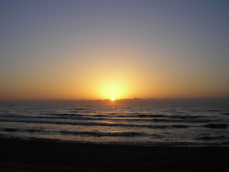
I choose a sunrise as a background because the perfume is going to be called 'Dawn' and so the background would link with the perfume name and make it more memorable. The sunrise will also make a haze around the model and the light coming from behind the model will make her a silhouette and make a stronger picture. The colours used for the background will be soft pinks and yellows and the perfume bottle will have a similar colour to the background, either pink or yellow to link it to the scene, although the perfume bottle will have a brighter colour so it draws the attention.  I decided to have the model silhouetted because it will make the model look more seductive and enigmatic. I have decided to have the model wearing a shorter dress because it implies confidence. The silhouettes with longer dresses look like they are going to a party which would imply that the perfume is only for special occasion use, soI decided to have the model wearing a shorter dress becuase it looks less formal and so the perfume does too.
The perfume is going to be in the foreground of the picture and be quite big and colourful so it catches attention, it will most likely be a brighter version of the sunrise colours, so either dark pink or golden yellow.
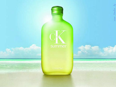
The genre of the advert is going to be seduction and romance and the target audience is 20 to 30's. The slogan will be "Feel Renewed", I chose this because the perfume is called Dawn and dawn signifies a new day and a fresh start so the slogan links in with the perfume.
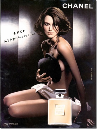
 The Dior perfume advert represents freedom and an idealistic lifestyle. The balloons are pulling the model up and away from normal society so it connotes better lifestyles, the background birdseye view of Paris shows an fanciful life in a romantic city. Paris is shown as small in the background of the picture which focuses the attention on the model. The model is wearing pink which is a colour that implies love and romance, she is holding a huge bottle of perfume which also draws the eye and links the perfume to the idealized scene. I like that the picture is colourful and attracts attention if seen in a magazine or on a billboard. I think that I will have a very colourful perfume bottle to be striking in the advert to catch the audiences eye.
  The Gucci Envy advert shows two models about to kiss which implies that using Envy will make other people envious of the consumer. The perfume bottle is the only item in colour in the scene and balances well with the picture of the models so they don't outshine each other. The trademark 'Gucci' and the perfume name 'Envy' is written in white which contrasts against the skin of the models and stands out. I like the idea of the words being a contrasting colour to the scene behind it because it can be read easily and is prominent in the scene.
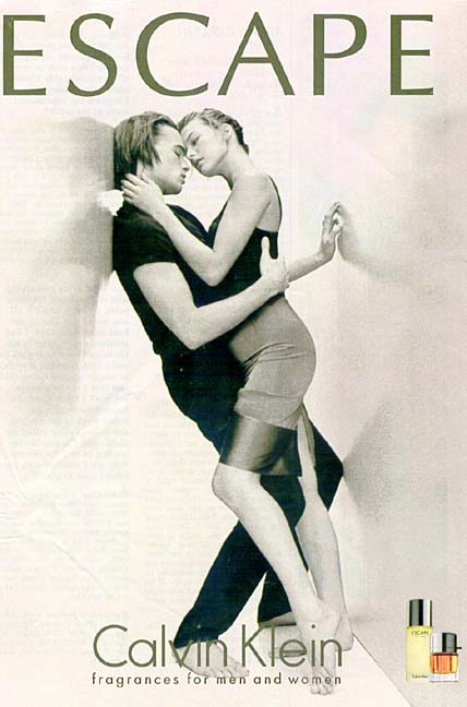 The Calvin Klein advert has very dull tones and the purfume bottles are in colour, this implies that the perfume 'Escape' will brighten up the consumers life. The trademark is in big letters because some consumers like brand names. The scene is quite large and the models seem to overshadow the perfume bottle but the perfume name is huge and this balances it out. I like that the female model is wearing a dress because it looks seductive. The perfume is for both males and females so I like that there is both genders in the picture to show this.
 Britney Spears perfume is shown with connotations of animals and nature, the perfume is green which stands out against the soft colours of the scene. The model wears white to symbolise innocence and the slogan "The greatest freedom is to believe in yourself" ties in with the freedom of birds. Most of the birds in the scene are in white cages which also ties to the model to imply that she has power over the freedom of the bird and therefore herself. I like that the model interacts with the other things in the scene.
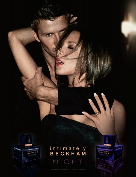
 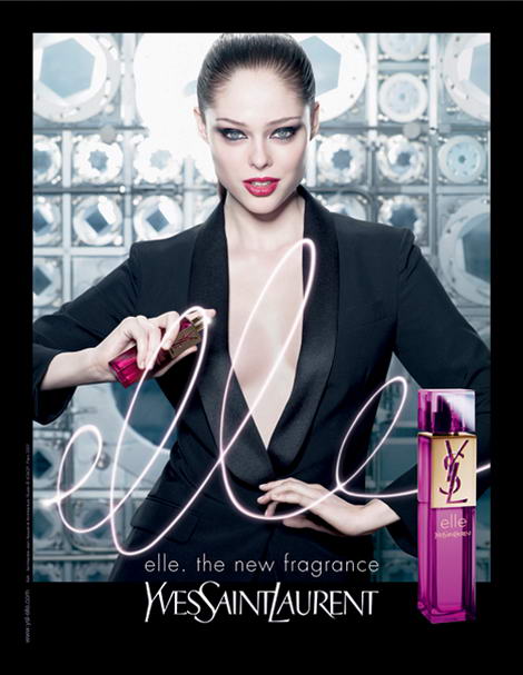 This advert looks quite sophisticated becuase the black, purple and blue colours look edgy and refined. The model is wearing black and has her hair tied back which looks professional and implies and good career and this is an idealistic lifestlye. The model looks like a career women which targets career women or women who want a career. The scene is involved with the perfume becuase the model is holding the perfume and appears to have written out the perfume name. The perfume name is the centre point of the advert and attracts the most attention. I like the seductiveness of the model wearing black becuase it can look both professional and mysterious.